Takes in a ranges_df dataframe and makes a plot (for redox).
plot_ranges_redox.RdTakes in a ranges_df dataframe and makes a plot (for redox).
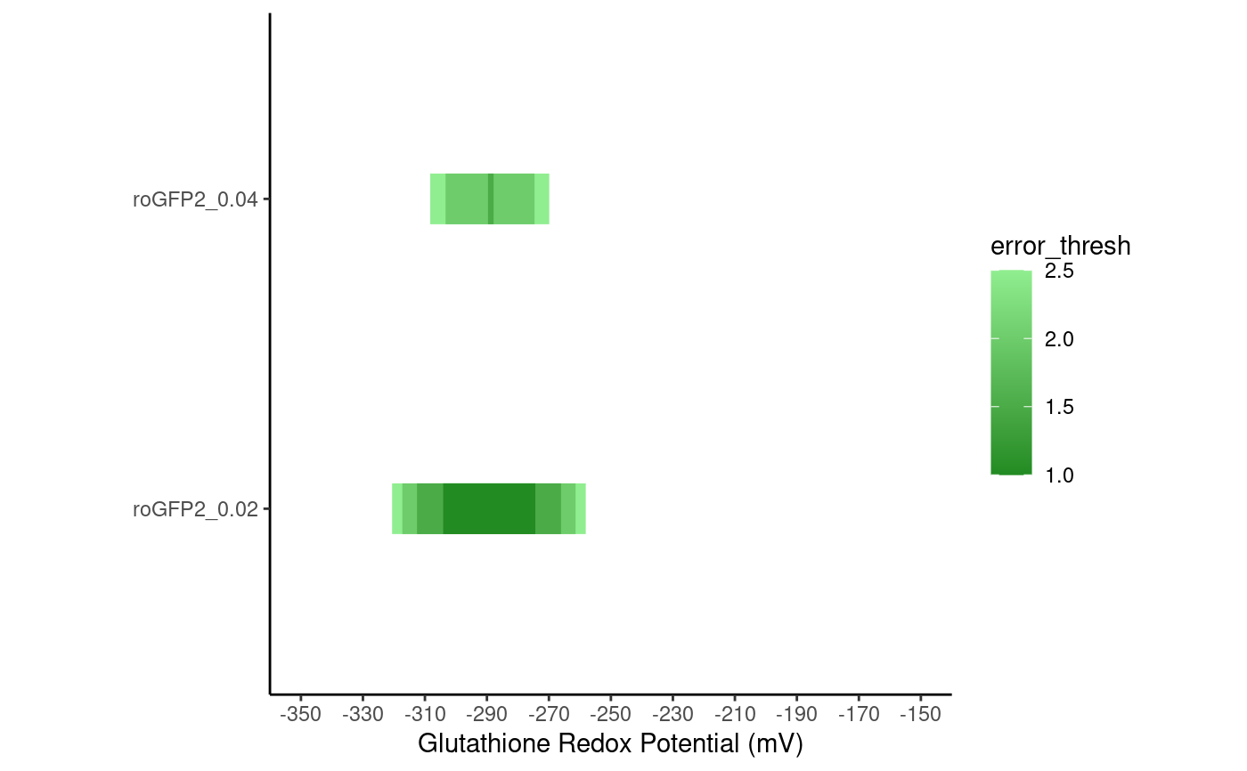
plot_ranges_redox(
  ranges,
  ylim = c(-350, -150),
  by = 20,
  ylab = "Glutathione Redox Potential (mV)"
)
Arguments
| ranges | A dataframe of ranges with at least these columns: 'Sensor_Name': the name of the sensor 'Minimum': the minimum redox potential (mV) measurable at the given inaccuracy 'Maximum': the maximum redox potential (mV) measurable at the given inaccuracy 'Inaccuracy': the inaccuracy associated with this row (relative) 'error_thresh': the error threshold associated with this row (mV) |
|---|---|
| ylim | The limits of the ranges plot |
| by | the 'by' argument of the limits axis tick marks |
| ylab | The label of the ranges plot |
Value
A ggplot object
Examples
error_df <- create_error_df_redox_multiple(
  c(0.02, 0.04), -400, -200,
  data.frame(
    Rmin = 0.97,
    Rmax = 4.12,
    delta = 0.23,
    name = "roGFP2",
    e0 = -299
  )
)
ranges_df <- create_ranges_multiple(error_df)
plot_ranges_redox(ranges_df)